We delivered
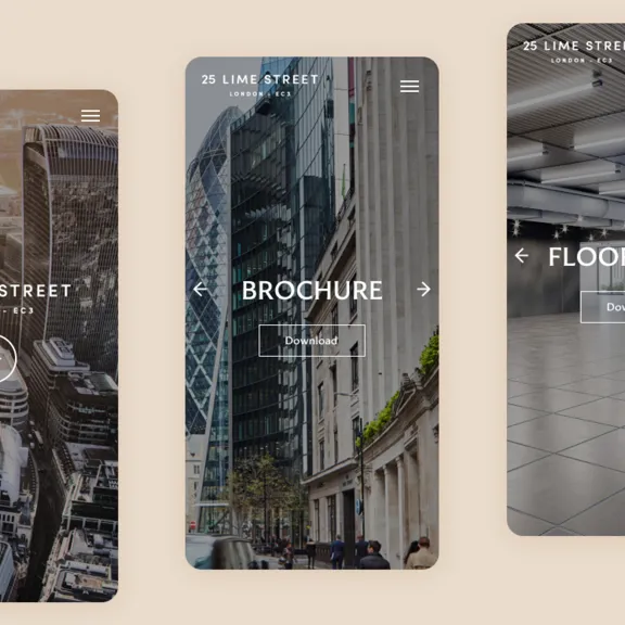
Branding Architectural Photography Website Marketing Brochure CGIs CGI animation
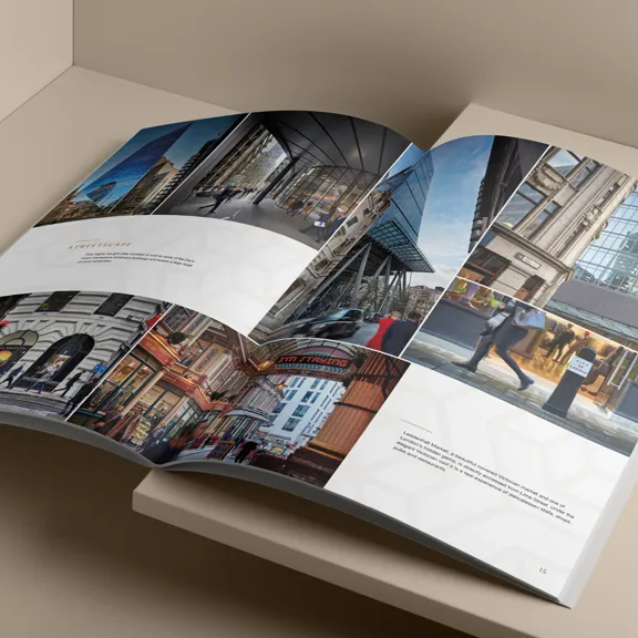
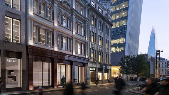
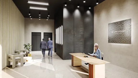
24-26 Lime Street was another unique project. Sitting on Lime Street within the world's largest insurance market, the listed facade of 2 adjoining buildings were to be retained, with the rest of the buildings being demolished and replaced with one contemporary new build workspace. There was a lot more to the book than what could be read on the cover.
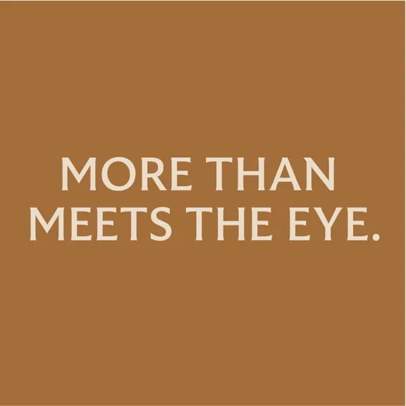
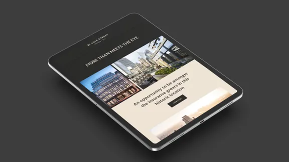
For brands that like their business to have great character beneath the surface. Lime Street offers an space that is not what it first appears to be. It's 'More than meets the eye.' This campaign concept inspired everything from the chosen typeface (with its hidden details), the brand pattern with hidden LS initials within, to the unique CGI animation that stood out in the insurance world.
MORE THAN MEETS THE EYE
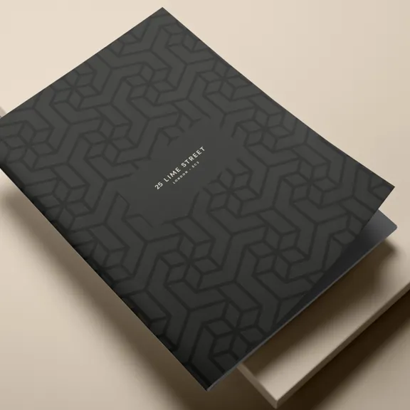
For brands that like their business to have great character beneath the surface, Lime Street offers an environment that is not what it first appears to be. A building that is more than meets the eye. With that in mind, we were inspired by optical illusions to build the Lime Street pattern, with the 'L' and the 'S' hidden within it. We also opted for a font that isn't quite what it seems. At first glance, FS Benjamin seems like your standard sans serif typeface. It’s not until closer inspection that it reveals beautiful serif features.

Further Case Studies
Take a Look
Ready to stand out?
Drop us an email at: standout@cabproperty.co.uk
Phone us on: 07494 488 864