We delivered
Branding Campaign Messaging Marketing Brochure Digital Marketing
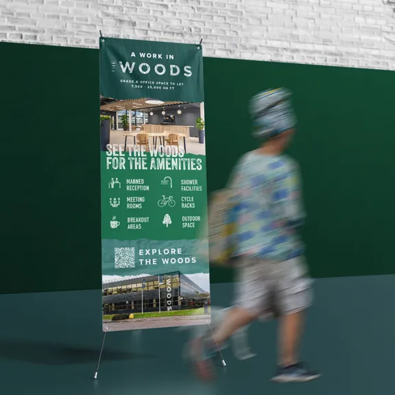
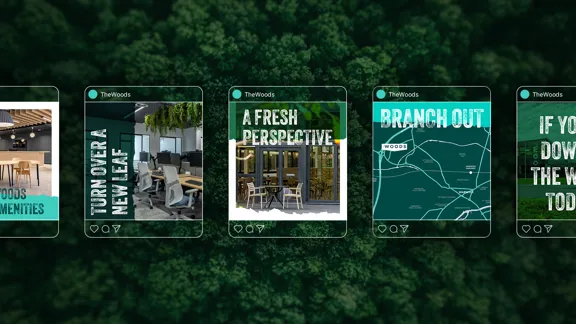
The Woods as a name is bold and different for the office market and has already proved it has helped attract the right people to fill the space. To achieve full occupancy, the marketing material needed to have the same stand out as the name itself by incorporating character and personality. Block printed graphic textures to represent the natural elements, alongside colours that include earthy and energising tones helped to set this new direction, turning over a new leaf.

BUILDING A BRAND
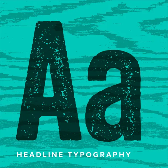
Using the existing logo allowed the brand to retain its core identity, but by adding the distressed wood grain effect, it could be wrapped around the new brand more cohesively. The suite of block printed graphic textures were then crafted to represent the natural elements. We also introduced raw shapes to mimic the textures of bark. These shapes were used to add texture to solid colours and break up photography, reflecting the rustic nature of The Woods.
INJECTING COLOUR
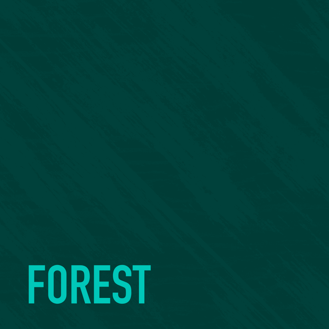
We chose a deep and rich colour way, complemented by a bolder, energising blue to cut through the earthy tones, while still sitting harmoniously with the nature-inspired palette. A chance to branch out.
Further Case Studies
Take a Look
Ready to stand out?
Drop us an email at: standout@cabproperty.co.uk
Phone us on: 07494 488 864